Why subtitles are harder with dyslexia
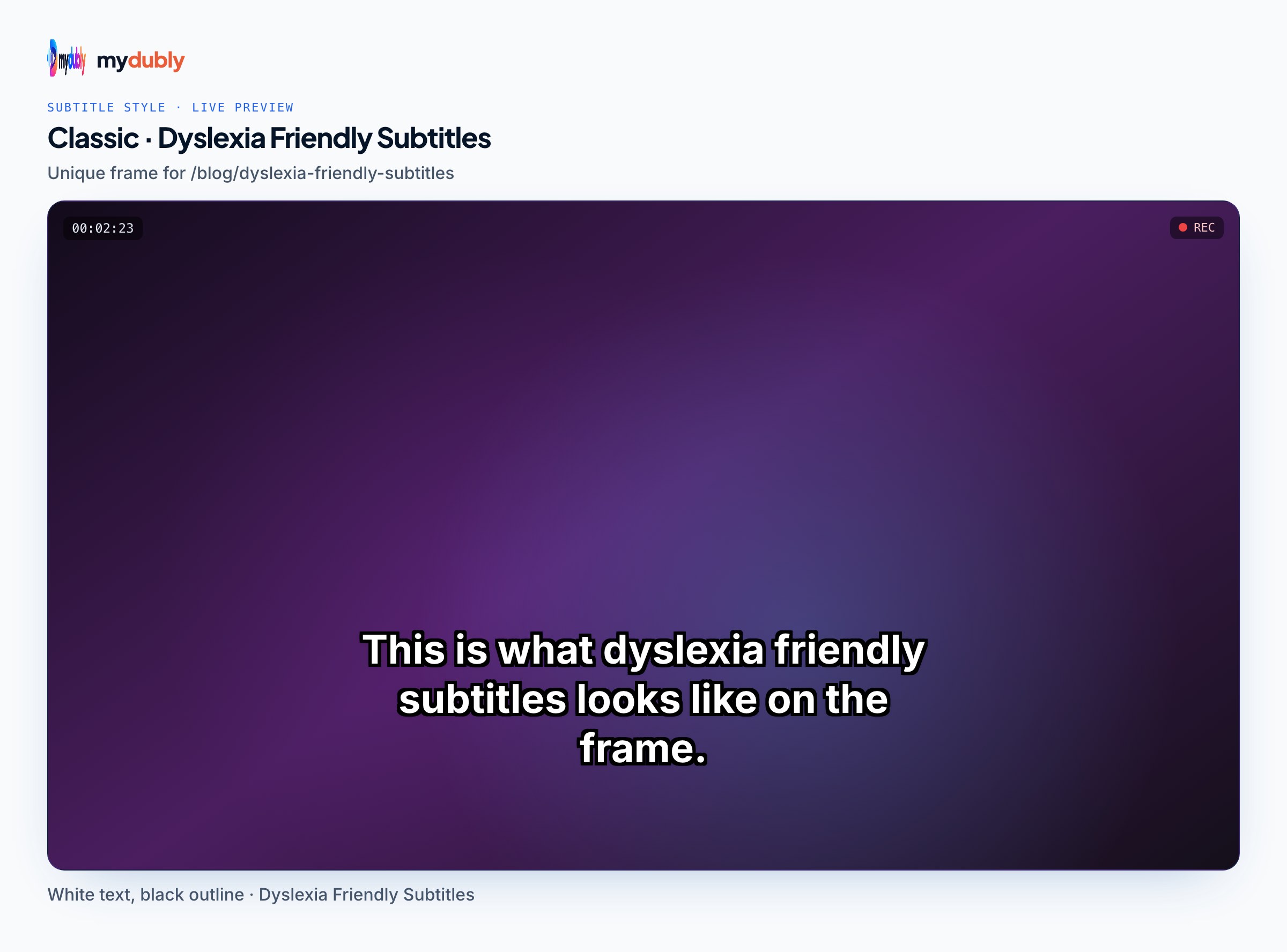
Dyslexia mainly affects decoding: turning letters into words quickly and accurately. Ordinary text lets a reader slow down, reread and keep their place. Subtitles take those options away. Each cue appears for a fixed time and then disappears, it sits over moving pictures, and it competes with faces and action for attention. A reader who decodes more slowly may finish a line just as it vanishes, or skip the picture entirely to keep up.
Nothing in a style choice removes that pressure, but presentation can lower it: shapes that are quick to recognise, words that do not crowd each other, a stable background and fewer, shorter lines that stay up longer. This page covers what the evidence supports, where it stops, and how to apply it. For general readability rules that apply to every viewer, subtitle readability is the companion guide.
What research says about fonts
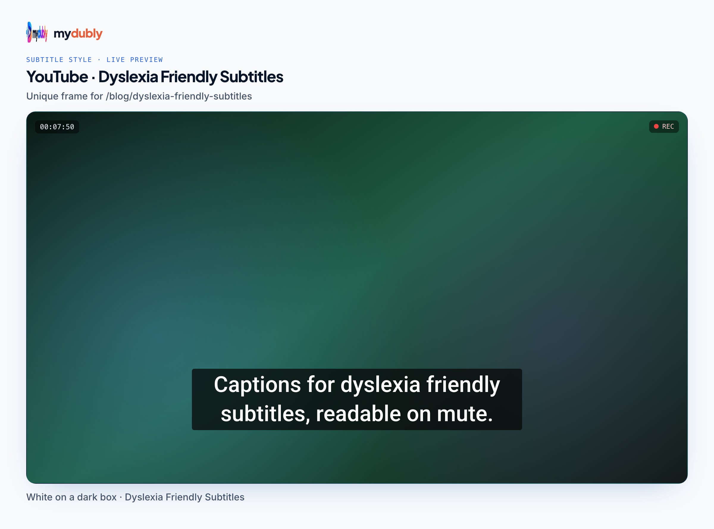
The most cited study is an eye-tracking experiment by Luz Rello and Ricardo Baeza-Yates, published in ACM Transactions on Accessible Computing in 2016. It tested 12 fonts with 97 participants, 48 of them with dyslexia, reading on screen. Sans serif, monospaced and roman (upright) styles improved reading performance compared with serif, proportional and italic styles. The fonts the authors recommended were Helvetica, Courier, Arial, Verdana and Computer Modern Unicode, and they advised against Arial Italic. OpenDyslexic, a font designed for dyslexic readers, was among those tested and was not among the recommended ones.
A second paper by the same authors in Universal Access in the Information Society (2017) found that larger font sizes and wider character spacing helped people with and without dyslexia read faster. The British Dyslexia Association's style guide points the same way: plain sans serif fonts, no italics or underlining for emphasis, no long runs of capital letters, and generous spacing.
Two honest limits. These studies used static text on a screen, not moving subtitles over video, so the findings are an informed starting point rather than a tested subtitle standard. And dyslexia varies: some readers prefer a font that others dislike. Offer a sensible default, and where the platform allows it, let viewers change it.
About "dyslexia fonts"
Fonts such as OpenDyslexic and Dyslexie are marketed for dyslexic readers, often with weighted letter bottoms or exaggerated shapes. The research above does not show them beating ordinary sans serif fonts, and many dyslexic readers say they find them no better or harder to read. If an individual viewer likes one, that preference is valid for their own settings. For a burned-in subtitle that everyone sees, a common sans serif is the safer choice.
Broadcasters have experimented here too. In April 2023, RFI reported that the French channel Canal+ had developed Dystitles, a subtitle typeface for dyslexic viewers, with the association Puissance Dys. It is one broadcaster's project, not an evaluated standard, but it shows the question being taken seriously beyond small blogs.
A dyslexia-friendly subtitles style recipe
- Font
- A plain sans serif with clear, distinct letter shapes. Avoid condensed display fonts, decorative fonts and serifs.
- Weight
- Regular to semi-bold. Very heavy weights close up letter gaps and make words blur together.
- Size
- Larger than your usual default, checked on a phone screen as well as a monitor.
- Letter spacing
- A small increase over the font's default. Too much breaks words apart.
- Case and emphasis
- Sentence case. No italics and no all caps; if you must emphasise, do it in wording.
- Background
- A solid or near-solid box behind the text, so contrast does not change with the footage.
- Colour
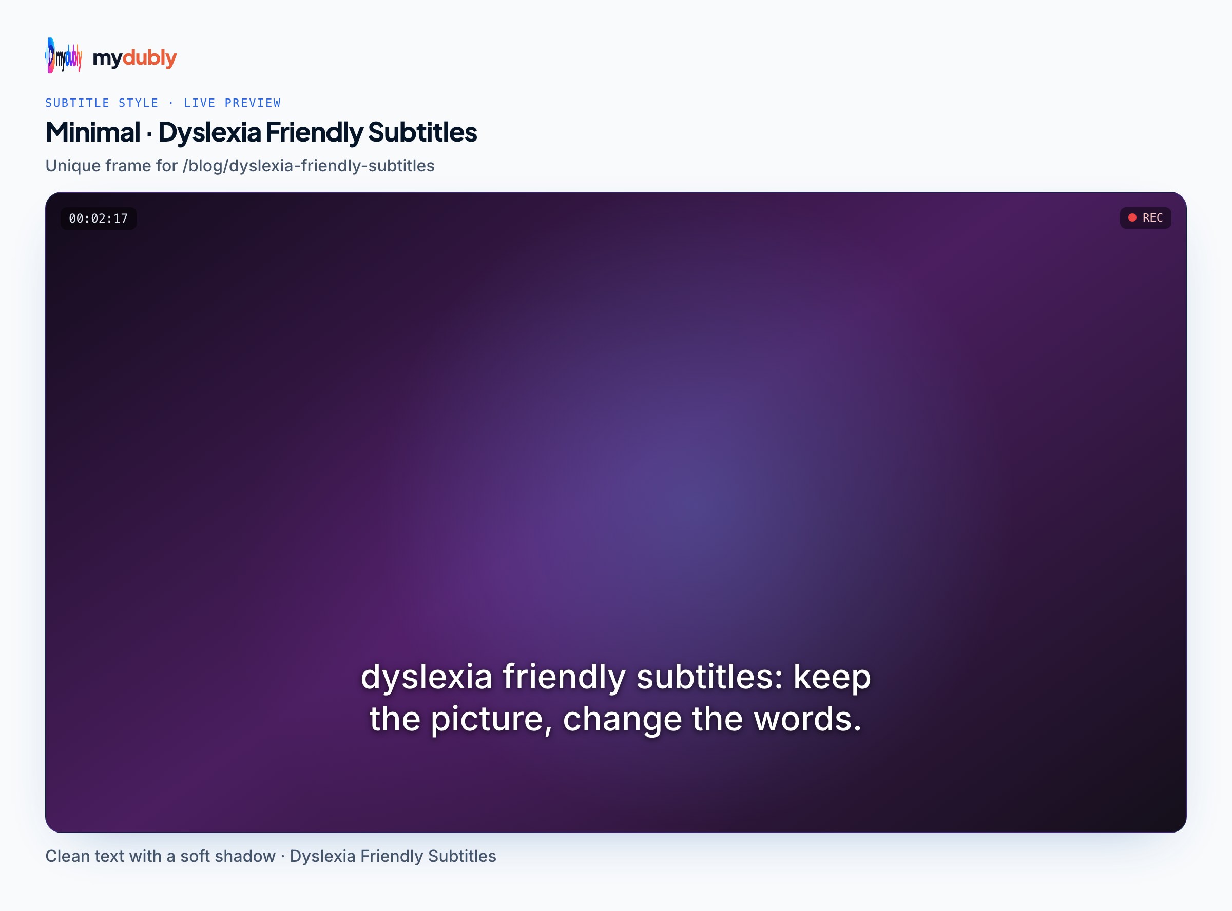
- Light text on a dark box. If stark white on black feels glaring, try off-white text on dark grey.
- Lines
- One line per cue when the text allows, two at most, kept well under the usual 42-character limit.
- Timing
- Longer on screen than the minimum, with cue breaks at natural phrase boundaries.
Segmentation matters as much as the font. A cue that breaks between "the" and "results" forces a reader to hold half an idea while the next cue appears. Subtitle segmentation covers where to break lines and cues.
How to set it up in the mydubly subtitle editor
The free subtitle editor runs in the browser and uses one style for the whole video. Its Style tab has the controls this recipe needs.
- Open your video, then get subtitles: generate them from the speech, import an SRT or VTT file, or type them yourself.
- In the Style tab, start from the High Contrast preset (Noto Sans, yellow text on a solid black box) or the YouTube preset (Roboto, white text on a dark box).
- Pick a plain sans serif from the 19 fonts. Open Sans, Noto Sans, Roboto, Inter and Lato are all straightforward choices; skip the condensed and display fonts such as Bebas Neue, Anton, Oswald and Bangers, and the serif fonts.
- Raise Size until a full line is easy to read on a phone-sized preview, and set the weight to regular or semi-bold rather than the heaviest option.
- Nudge Letter spacing up slightly and Line height up a little, so the two lines of a cue do not crowd each other.
- Leave Italic and UPPERCASE switched off.
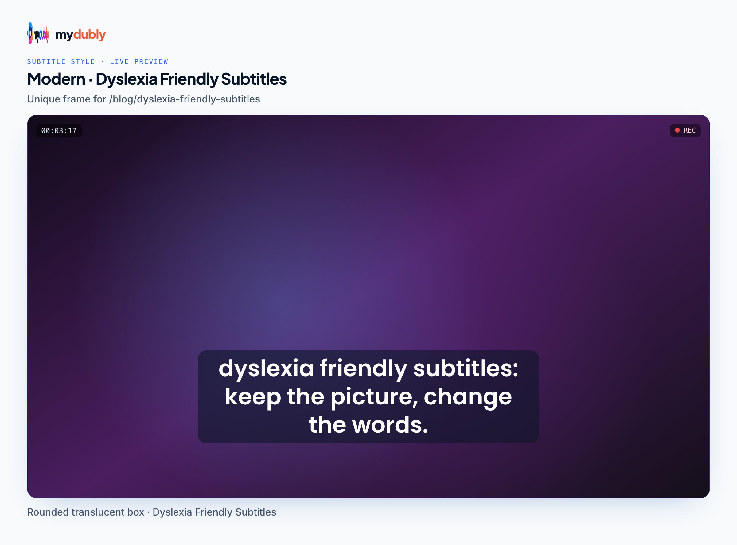
- Under Background, choose Box or Rounded and push the background colour close to fully opaque. Set the text colour to white, off-white or yellow.
- Lower Max line width if lines run across most of the frame; shorter lines mean less eye travel.
- Go through the line list. The editor warns about cues faster than 21 characters per second, lines longer than 42 characters, cues under 0.8 seconds and overlaps. Treat those as ceilings: split long cues, trim filler words, and extend cues into the gap before the next one.
- Export SRT or VTT as well as the rendered MP4, so viewers on platforms that support caption tracks can restyle them.
A teacher burns in subtitles for a five-minute lesson. She switches from a condensed bold font to Open Sans semi-bold, adds a solid black box, splits two-line cues into single lines at each clause, and extends each cue into the pause after it. The video runs the same length; the subtitles simply sit on screen longer and carry less at once.
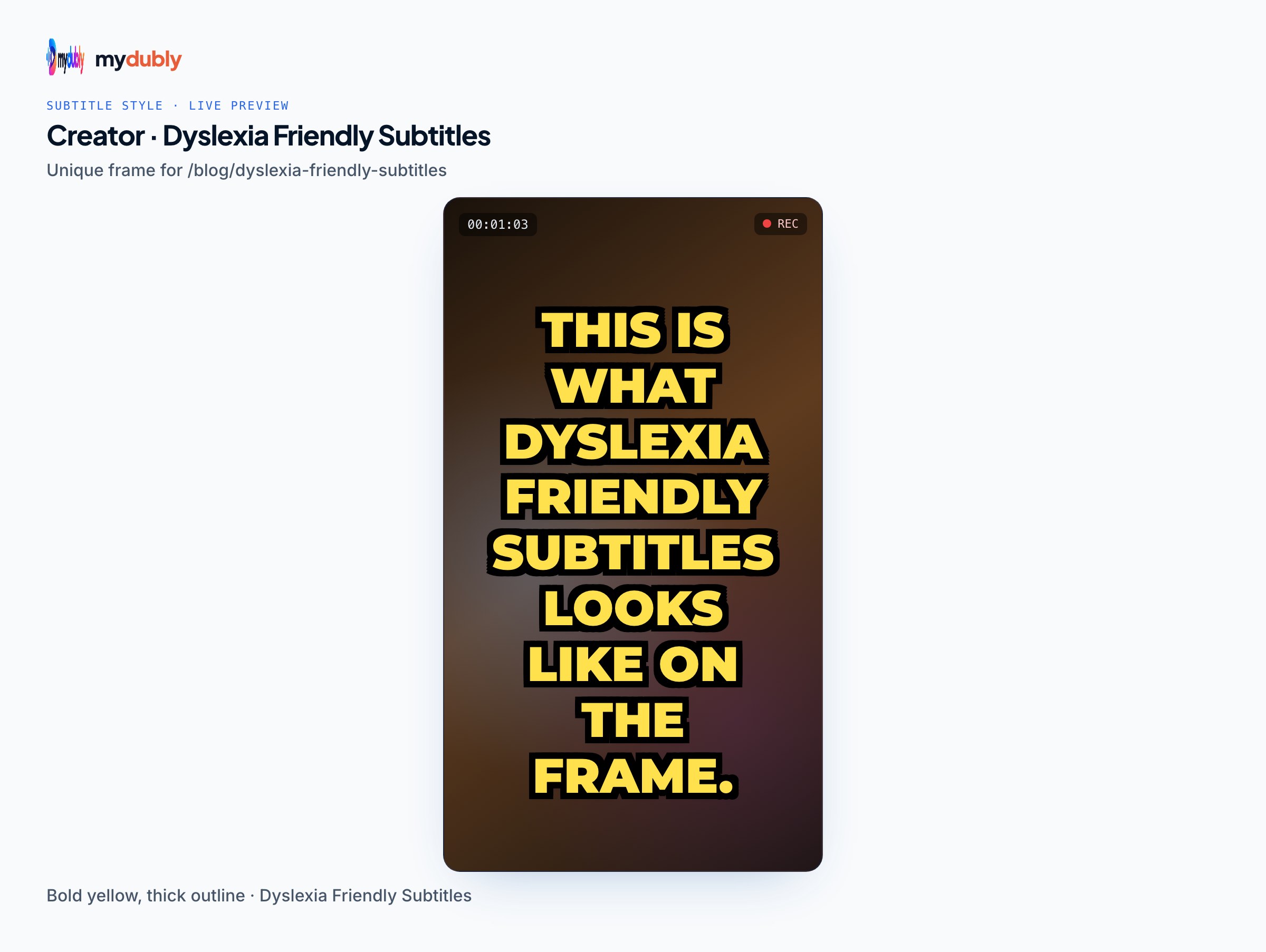
A short vertical clip had all-caps yellow text with a thick outline and no box. The team keeps the yellow for brand recognition but moves to sentence case, adds a dark rounded box and enlarges the text, checking the safe area so nothing sits under the platform buttons.
Viewer settings versus burned-in subtitles
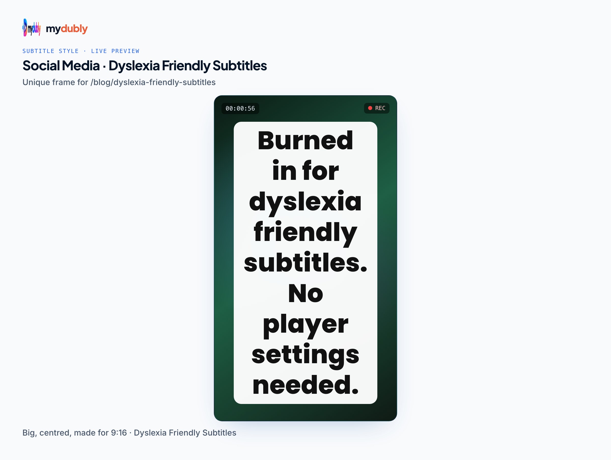
Streaming services such as Netflix, Disney+ and the Apple TV app let viewers change subtitle appearance in their settings, typically the font, size and background. Those settings only apply to closed subtitles delivered as a separate track. Subtitles burned into the picture are part of the video, so no player can restyle them. That is why the style choice matters most for creators who burn in, and why it helps to offer a closed caption file alongside. Open vs closed captions explains the trade-off.
Less text, not just better text
Cue length is the lever most creators overlook. Speakers say more than a reader can comfortably follow, so trimming repetitions, false starts and filler words gives dyslexic readers more time per word. Be careful with captions for deaf and hard-of-hearing viewers: sound descriptions and speaker names are information they need. If you make a separate version for hearing viewers who read along, removing SDH from an SRT file strips bracketed sound descriptions and speaker labels to shorten cues; keep the full version for viewers who rely on captions.
Where AI subtitles fall short
Automatic subtitles are built for speed, not for these readers. Speech recognition splits cues by pauses and timing rather than by meaning, so breaks often land mid-phrase, and it transcribes every word the speaker says, including filler, which makes cues dense. Recognition errors are especially costly for a reader who decodes slowly, because an unexpected wrong word takes longer to notice and reinterpret. The subtitle generator creates SRT and VTT drafts in 100 languages for 5 credits per minute (minimum 25 credits per file), so a five-minute lesson costs 5 credits (0.5¢); a person should still review every line for accuracy and rework the segmentation before applying the style above. The editor's style is static, with no per-word highlighting or animation.
Frequently asked questions
Which font should subtitles use for viewers with dyslexia?
There is no single proven best font. Eye-tracking research found that common sans serif and monospaced fonts such as Helvetica, Arial, Verdana and Courier performed better for dyslexic readers than serif and italic fonts, so a plain sans serif is the evidence-based default.
Do dyslexia fonts like OpenDyslexic make subtitles easier to read?
The research does not show it. OpenDyslexic was included in a 2016 eye-tracking study and was not among the fonts that helped. Individual viewers may still prefer it in their own settings.
Should subtitles for dyslexic viewers be in all caps?
No. Capital letters remove the varied shapes of lowercase words that help recognition, and dyslexia style guidance advises against long runs of capitals. Use sentence case.
Is a background box better than an outline for dyslexic readers?
A solid or near-solid box keeps contrast steady whatever the footage behind it, which removes one source of visual noise. An outline can work over plain backgrounds but becomes harder to read over busy or bright scenes.
Can viewers change burned-in subtitles to a dyslexia-friendly style?
No. Burned-in subtitles are part of the picture, so player settings cannot change their font, size or background. Provide a separate SRT or VTT track as well so viewers can use their own settings where the platform supports it.
How long should a subtitle stay on screen for dyslexic viewers?
Longer than the minimum, and long enough to read the whole cue comfortably. Shorter cues, fewer filler words and extending each cue into the pause before the next one all give more reading time without changing the video.